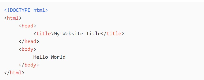
DOCTYPE html: This is the DOCTYPE declaration. It’s actually not technically an HTML tag, rather it’s a declaration which tells the web browser what type of file this is.The browser will see this and know to treat the file as HTML document.
NON-CONTAINER TAGS- These are tags which don’t have a starting and an ending component, instead they’re just a single structure. These tags will have a forward slash right next to the greater-than sign on the right.
CONTAINER TAGS- Container Tags are comprised of two tags that go together, an opening and a closing tag head tag- The head tags are basically the settings for your HTML document. In here we can place all sorts of special tags which will help to configure and provide meta-data about the html document itself. These specify the name of the webpage, and whatever is in here will show up in the tab of the page. body tag- It’s inside of these tags that we’ll place all of the content that is meant to appear on the web-page. title tag : These specify the name of the webpage, and whatever is in here will show up in the tab of the page.
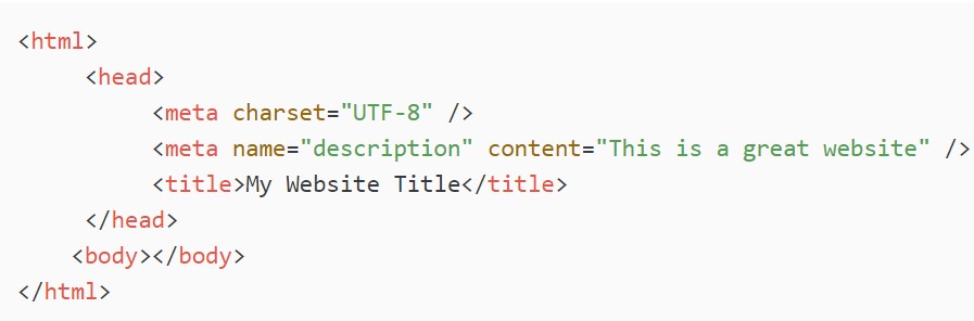
Meta Tags(Non-Container Tags):Meta tags are used in the head of the website to provide meta data to the browser as well as other applications like web scrapers. You can use meta tags to add a description, author, date of publication, keywords, etc, to the meta data of your site.
We can add information to a tag like so: name="description" or charset="UTF8". These little key value pairs are called attributes and they provide input into an HTML tag with more information about what it’s doing. There are hundreds of these attributes, and in the case of the meta tags, they’re specifying different pieces of meta information.
Headers(Container Tags):In all there are 6 different types of headers we can use h1,h2,...,h6. As the numbers get smaller so does the text that they display.
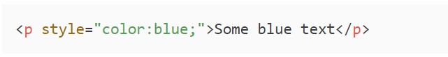
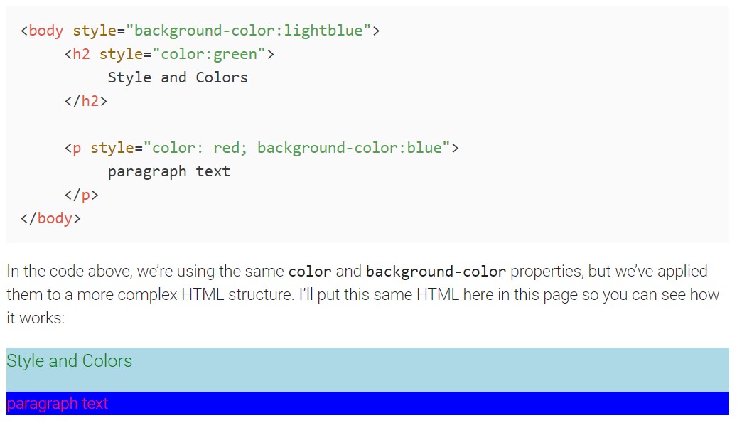
Changing Text Colors We’ve added the style attribute. Inside I’ve defined that the color of the text should be blue. This is actually a CSS statement. CSS statement’s allows us to change certain stylistic aspects of the HTML element.
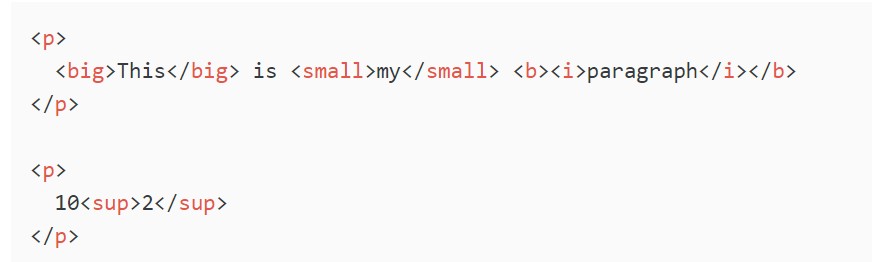
FORMAT OF TEXT It’s important to note that these tags don’t actually change the format or the styling of the content inside. Instead they act as descriptors and containers which indicate the type of content inside of them.Websites which rank highly on keyword searches often use tags like this for organization. As a general rule, the more descriptive and clear the HTML on your page is, the easier it will be for search engines to understand it.
HTML Formatting element
Tags
Description
< b >
Bold Text
< strong >
Important Text
< i >
Italic Text
< em >
Emphasized Text
< mark >
Marked Text(text that we want highlighted)
< small >
Smaller Text
< ins >
Inserted Text
< sub >
Subscript Text
< sup >
Superscript Text
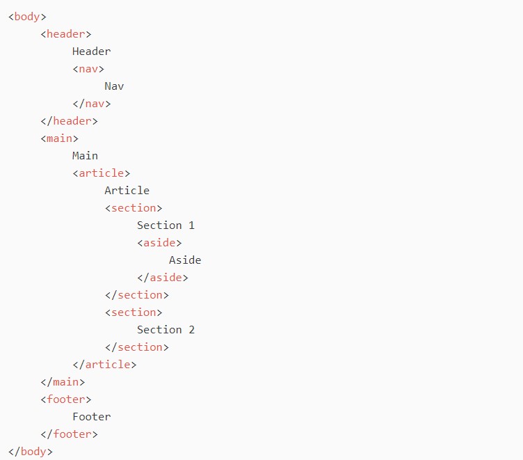
Header Part:Generally reserved for content that will sit at the top of a webpage. This will include a series of links to common pages on the site, and often times interactive elements like a search bar or settings menu.
Inside Header tag we generally use nav (navigation tag).
Nav Tag:Generally reserved for content that will sit at the top of a webpage.This will include a series of links to common pages on the site, and often times interactive elements like a search bar or settings menu.Mostly link are placed inside the nav tags ,which allow you to link to other content on your site.
Main tag:Main section indicates where all the main content of the site will live.The main sections is where most of the interaction on the site will take place, and where the user’s attention will be directed most of the time. Therefore when laying out a website, the main should have the most content inside of it.
All of this text that you’re reading, the video embedded up above, and the side bar with navigation links is all part of the main section of the website. Search engines will generally be looking in the main section of your website to learn what your page is about and what content is unique to this page in particular.
There are SECTION,ARTICLE,ASIDE, tags that can be used for FORMATTING THE TEXT
ASIDE TAG: The aside tag is used for any content which is not part of the main content of your page.This let’s things like search engines know that it doesn’t belong as part of the article or normal main content.For eg.ads appearing on the website will go onto aside. ARTICLE TAG: We can use the special Article tag to indicate if something is an article. Again this is really useful for search engines because they can tell exactly where the article content is and more easily index it.
FOOTER : The footer of the tags is similar to header in that it generally stores links to common pages on the site and also branding information.
HTML Quotation and Citation Elements
Tag
Description
< abbr >
Defiens an abbreviation or acronym
< address >
Defiens contact informationfor the author/owner of a document
< bdo >
Defines the text direction
< blockquote >
Defines a section that is quoted from another source
There are three ways for specifying the lists:ordered,unordered and description lists
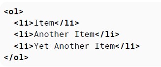
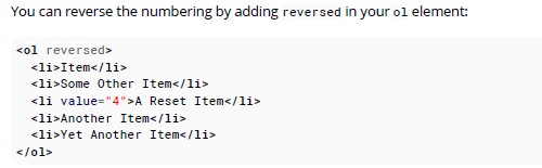
ORDERED LISTS:An ordered list can be created with the ol tag and each list item can be created with the li tag There are couple of ways we can use lists such that we can add numbers appearing on the list items in an ordered list.The first way is to set a starting number, using the start attribute. The list will start at this defined number, and continue incrementing by one as usual.
For example:
Item
Some Other Item
Yet Another Item
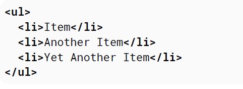
UNORDERED LISTS:An unordered list can be created with the ul tag and each list item can be created with the li tag as shown by the example below:
We should use ul to display a list of items, where the order of the items is not important. If changing the order of the items makes the list incorrect, you should use ol.
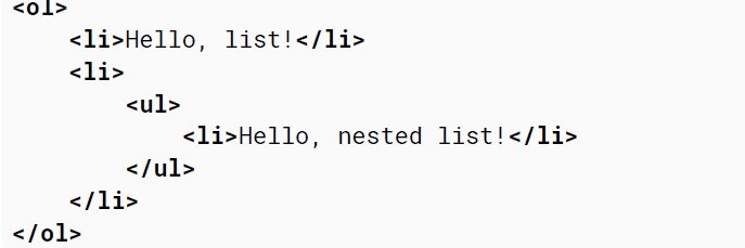
NESTED LISTS: DESCRIPTIVE LISTS:A description list can be created with the dl element. It consists of name-value groups, where the name is given in the dt element, and the value is given in the dd element.
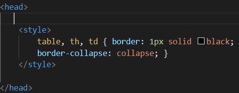
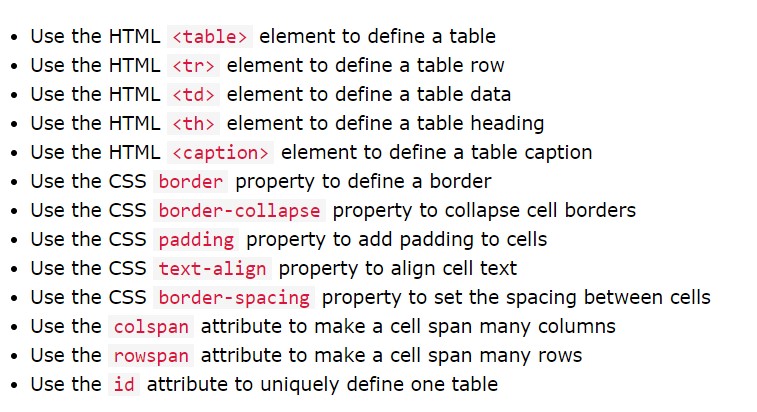
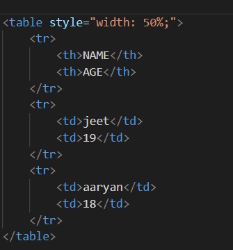
The HTML table element allows web authors to display tabular data (such as text, images, links, other tables,etc.) in a two dimensional table with rows and columns of cells.
Each table row is defined with a tr tag. Each table header is defined with a th tag. Each table data/cell is defined with a td tag. By default, the text in th elements are bold and centered. By default, the text in tdelements are regular and left-aligned.
Note: The td elements are the data containers of the table. They can contain all sorts of HTML elements;text,images, lists, other tables, etc.
Format of writing the TABLE: Table cells can span multiple columns or rows using the colspan and rowspan attributes. These attributes can be applied to th and td elements.
Caption tag is used to add caption to the table.
Cell Pading: Cell padding specifies the space between the cell content and its borders.If we do not specify a padding, the table cells will be displayed without padding.
Aligning the table:
Special Style for Table: To define a special style for one particular table, add an id attribute to the table
London is the capital city of England. It is the most populous city in the United Kingdom, with a metropolitan area of over 13 million inhabitants.
Standing on the River Thames, London has been a major settlement for two millennia, its history going back to its founding by the Romans, who named it Londinium.
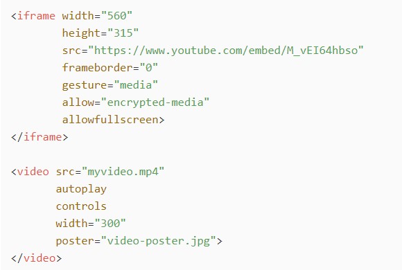
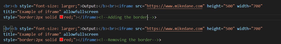
The term "IFrame" means Inline Frame. It can be used to include another page in your page. This will yield a small frame which shows the exact contents of that field.
Format of writing iframe Code: Output:
BORDER:
Target for a Link
An iframe can be used as the target frame for a link. The target attribute of the link must refer to the name attribute of the iframe.
Mike Dane Website-click here
When the target attribute of a link matches the name of an iframe, the link will open in the iframe.
srcdoc:
The srcdoc attribute can be used (instead of the src attribute) to specify the exact contents of the iframe as a whole HTML document. This will yield an IFrame with the text "IFrames are cool!"
input type="text" Defines a single-line text input field. The default width of a text field input is 20 characters. This can be changed by specifying a value for the size attribute like this: An input text field only allows one line of text. If you need a multi-line text input for substantial amount of text, use a textarea element instead.
Value attribute helps us to set default value in the text field.
2
Input type PASSWORD
Enter your name
Password
3
Input type SUBMIT
input type="submit"
A submit input creates a button which submits the form it is inside when clicked.
If value attribute is omitted than it will be taking a by default value of ‘Submit’.
4
Input type RESET
input type="reset" defines a reset button that will reset all form values to their default values. But, to make this reset button functional(data which is inside the form tag) we need to put all our code in form tag. The button will only reset the elements within this form.
Enter your name
Password
5
Input type RADIO
input type="radio" defines a radio button. Radio buttons let a user select ONLY ONE of a limited number of choices.
Value of name attribute should be same for a group of radio buttons.
To give context to the buttons and show users what each button is for, each of them should have a label. This can be done using a label element to wrap the button. Also, this makes the label clickable, so you select the corresponding button.
To provide label for entire group we used fieldset and legend tags.
6
Input type CHECKBOX
input type="checkbox" defines a checkbox. Checkboxes let a user select ZERO or MORE options of a limited number of choices.
Fruits
7
Input type BUTTON
Buttons can be used for triggering actions to occur on the page, without submitting the form. Buttons are typically used with an "onclick" event.
8
Input type COLOR
The input element with a type attribute whose value is color creates a button-like control, with a color equal to the value of color attribute.
Defaults to black if value is not specified or is an invalid hexadecimal format.
Color Picker
9
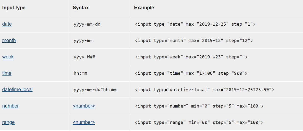
Input type DATE
The input type="date"is used for input fields that should contain a date. You can also use the min and max attributes to add restrictions to dates.
10
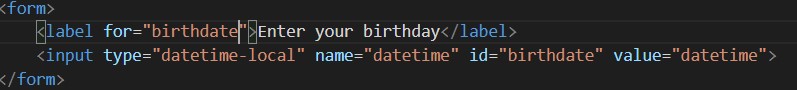
Input type DATETIME-LOCAL
input elements of type datetime-local create input controls that let the user easily enter both a date and a time, including the year, month, and day as well as the time in hours and minutes
11
Input type EMAIL
input elements of type email are used to let the user enter and edit an e-mail address, or, if the multiple attribute is specified, a list of e-mail addresses.
12
Input type FILES
input elements with type="file" let the user choose one or more files from their device storage.
13
Input type MONTH
input elements of type month create input fields that let the user enter a month and year allowing a month and year to be easily entered. The value is a string whose value is in the format "YYYY-MM"
14
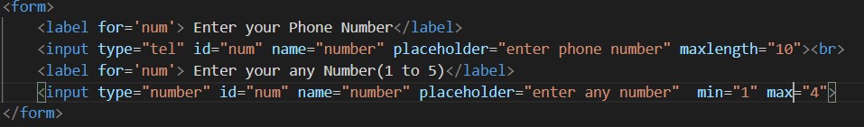
Input type tel and number
Input tel: elements of type tel are used to let the user enter and edit a telephone number. Input number: elements of type number are used to let the user enter a number. They include built-in validation to reject non-numerical entries
15
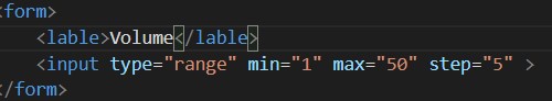
Input type RANGE
input elements of type range let the user specify a numeric value which must be no less than a given value, and no more than another given value.
Default range is 0 to 100. However, you can set restrictions on what numbers are accepted with the min, max, and step attributes.
Volume
16
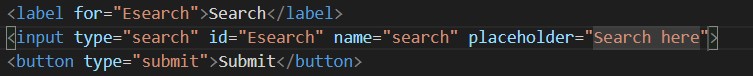
Input type SEARCH
input elements of type search are text fields designed for the user to enter search queries into
17
Input type IMAGE
input elements of type image are used to create graphical submit buttons, i.e. submit buttons that take the form of an image rather than text.
18
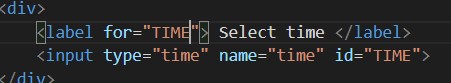
Input type TIME
input elements of type time create input fields designed to let the user easily enter a time (hours and minutes, and optionally seconds).
19
Input type URL
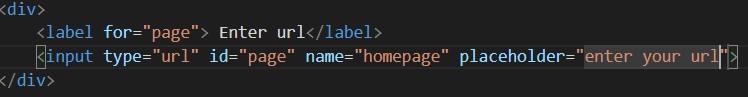
input elements of type url are used to let the user enter and edit a URL.
20
Input type week
The input type="week" allows the user to select a week and year.
There are different types of attribute for input tags
Value Attribute:
The input value attribute specifies an initial value for an input field. The value attribute is always optional,
though should be considered mandatory for checkbox, radio and hidden.
Input types: all
Readonly Attribute:
The input readonly attribute specifies that an input field is read-only. A read-only input field cannot be modified (however, a user can tab to it, highlight it, and copy the text from it).
The required attribute is supported by text, search, url, tel, email, date, month, week, time, datetime-local, number, password, checkbox, radio,file inputs etc.
Disabled Attribute: The Boolean disabled attribute, when present, makes the element not mutable, focusable, or even submitted with the form. The user can neither edit nor focus on the control,
nor its form control descendants. If the disabled attribute is specified on a form control, the element and its form control descendants do not participate in constraint validation. Often browsers
grey out such controls and it won't receive any browsing events,like mouse clicks or focus-related ones.
Input types: all
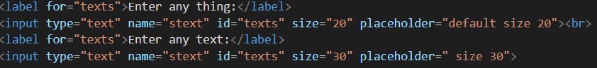
Size Attribute: The input size attribute specifies the visible width, in characters, of an input field. The default value for size is 20.
For password and text, it is a number of characters (or em units) with a default value of 20, and for others, it is pixels.
By adding size on some input types, the width of the input can be controlled. Adding size on a select changes the height, definining how many options are visible in the closed state
Input type:all
Maxlength and Minlength Attribute
Maxlength:The maxlength attribute defines the maximum number of characters (as UTF-16 code units) the user can enter into an input or textarea. This must be an integer value 0 or higher. If no maxlength is specified, or an invalid value is specified, the input or textarea has no maximum length.
Minlength:The minlength attribute defines the minimum number of characters (as UTF-16 code units) the user can enter into an input or textarea. This must be an integer value 0 or higher. If no minlength is specified, or an invalid value is specified, the input has no minimum length. This value must be less than or equal to the value of maxlength, otherwise the value will never be valid, as it is impossible to meet both criteria.
Input type:text,search,tel,url and password
Max and Min Attribute:The input min and max attributes specify the minimum and maximum values for an input field.
Tip: Use the max and min attributes together to create a range of legal values.
Input types and there format : number, range, date, datetime-local, month, time and week.
Multiple Attribute: The input multiple attribute specifies that the user is allowed to enter more than one value in an input field.
Input types:Email and File
Placeholder Attribute: The input placeholder attribute specifies a short hint that describes the expected value of an input field (a sample value or a short description of the expected format). The short hint is displayed in the input field before the user enters a value.
Input types:Text, search, url, tel, email, and password
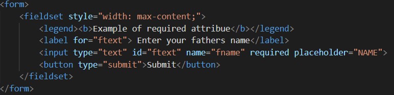
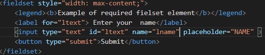
Required Attribute: The input required attribute specifies that an input field must be filled out before submitting the form.
Input types:Text, search, url, tel, email, password, date pickers, number, checkbox, radio, and file.
Height and Width Attribute: The input height and width attributes specify the height and width of an input type="image" element.
TIP: Always specify both the height and width attributes for images. If height and width are set, the space required for the image is reserved when the page is loaded. Without these attributes, the browser does not know the size of the image, and cannot reserve the appropriate space to it. The effect will be that the page layout will change during loading (while the images load). Input types:Image
List Attribute:The input list attribute refers to a datalist element that contains pre-defined options for an input element. The value given to the list attribute should be the id of a datalist element located in the same document The datalist provides a list of predefined values to suggest to the user for this input.
Input types:text, search, url, tel, email, date, month, week, time, datetime-local, number, range and color.
The HTML form element is used to create an HTML form for user input. The form element is a container for different types of input elements, such as: text fields, checkboxes, radio buttons, submit buttons, etc. HTML uses a form element to encapsulate input and submission elements. These forms handle sending the data in the specified method to a page handled by a server or handler.
There are different form attributes for eg. action, method, etc. which are used regarding form submission and how our form behaves, which will be discussed in further sub-sections of this chapter.
Label element
The label tag defines a label for many form elements. The label element is useful for screen-reader users, because the screen-reader will read out loud the label when the user focus on the input element.
You can click the associated label to focus/activate the input, as well as the input itself. This increased hit area provides an advantage to anyone trying to activate the input, including those using a touch-screen device. This makes an ease for the user to click on small regions such as radio buttons or checkboxes. Well, it can be used with any of the input type and many other form elements.
NOTE: The for attribute of the label tag should be equal to the id attribute of the input element to bind them together.
Select element
The select element defines a drop-down list.
The option elements defines an option that can be selected. By default, the first item in the drop-down list is selected. To define a pre-selected option, add the selected attribute to the option. Use the size attribute to specify the number of visible values. Use the multiple attribute to allow the user to select more than one value.
Textarea element
The HTML textarea element represents a multi-line plain-text editing control, useful when you want to allow users to enter a sizeable amount of free-form text, for example a comment on a review or feedback form.
Certain key points regarding textarea are as follows:
An ‘id’ attribute allow the textarea to be associated with a label element for accessibility purposes.
A ‘name’ attribute to set the name of the associated data point submitted to the server when the form is submitted.
The ‘rows’ and ‘cols’ attributes to allow you to specify an exact size for the textarea to take. Setting these is a good idea for consistency, as browser defaults can differ.
Default content can be entered between the opening and closing tags of textarea.
Textarea does not support the ‘value’ attribute.
The textarea element also accepts several attributes comon to form input's such as autocomplete, autofocus, disabled, placeholder, readonly and required.
Button Element
The HTML button element representsa clickablebutton, used to submit forms or anywhere in a documnet for accesible, standard button functionality. NOTE: Always specify the type attribute for the button element. Different browsers may use different default types for the button element.
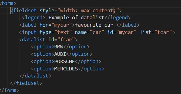
Fieldset and Legend element
The fieldset element is used to group related data in a form. The legend element defines a title for the fieldset element
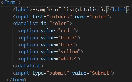
Datalist element
The datalist element specifies a list of pre-defined options for an input element. Users will see a drop-down list of the pre-defined options as they input data.
The datalist needs to given an id .The datalist is then bound to an input element (e.g. a text or email input type) using the list attribute, the value of which is the id of the datalist to bind.
Datalist basically is a normal text field which also gives suggestions to the user whether if he/she wants to select any of the options provided or else wants to add their own text in it.
Difference between SELECT and DATALIST element
Select is an form input type while Datalist isn’t.
Select input element presents options for the users from which they need to select one of them. On the otherhand,
Datalist presents a list of suggested values to the associated input form (text) field and users are free to
select one of those suggested values or type in their own value.
With Select, users may have to scan a long list for selecting one of the values, while with Datalist, the values are provided as hints and users ain’t bound to those values. They could rather provide their own inputs.
Output element
The HTML Output element output is a container element into which a site or app can inject the results of a calculation or the outcome of a user action.
The meta tag defines metadata about an HTML document. Metadata is data (information) about data.
The meta tags always go inside the head element, and are typically used to specify character set, page description, keywords, author of the document, and viewport settings.
Metadata will not be displayed on the page, but is machine parsable.
SETTING THE VIEWPORT
The viewport is the user's visible area of a web page. It varies with the device - it will be smaller on a mobile phone than on a computer screen. You should include the following meta element in all your web pages:
The width=device-width part sets the width of the page to follow the screen-width of the device (which will vary depending on the device).
The initial-scale=1.0 part sets the initial zoom level when the page is first loaded by the browser.


